Art is subjective.
Let’s get that out of the way, right up front. If you disagree with the perspectives expressed in this piece, I don’t think you’re a bad person. Misguided, perhaps, or even narrow-minded, but still, you’re entitled to like what you like for whatever reasons you choose to like it, and I’m equally entitled to roll my eyes at you.
Which is why I’m frequently exasperated when the Star Wars art of, say, Chris Trevas is regarded as being inherently good, and the art of, say, Scott Hepburn as inherently bad.
Trevas is an excellent artist, in my opinion—as is Tsuyoshi Nagano, the prolific Japanese artist whose name almost never comes up but whose work is goddamned everywhere. Outside of Star Wars, artists like Gabriele Dell’Otto and Greg Land are met with similar near-universal praise. All four artists are seen as exemplars of realism; of producing art that the viewer can almost believe is what a given scene or character would “really” look like. Exactly how well each of them pulls this off is again, subjective, *coughpornfacecough* but that’s fundamentally their shtick—it’s what lands a job in their inboxes instead of someone else’s.
But I think we fall into a couple traps when it comes to work like theirs—for one, “realistic” should not be synonymous with “perfect”. Star Wars earned its place in our culture in part by being the “dirty” sci-fi universe; likewise, before Carrie Fisher became the ultimate nerd sex symbol she was met with many a raised eyebrow for being “nontraditionally” attractive—not Farrah Fawcett, in other words. In much of Trevas’ work, and almost always in Nagano’s, nary a hair is out of place. Complexions are pristine. Characters in their fifties could be mistaken for their own children, but for a splash of grey hair (though Trevas is much better about that).
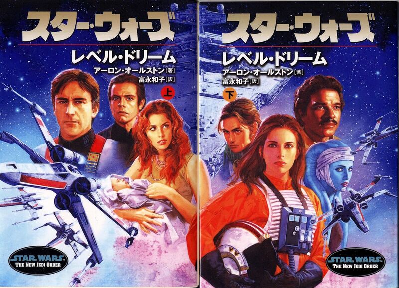
And even the characters that should look young and relatively fresh-faced are so idealized and genericized that they’re a step or two shy of porcelain dolls. Is Jaina Solo attractive on the Japanese New Jedi Order covers? I suppose; in a nonthreatening, Neutrogena-commercial kinda way. Does she look like the child of Harrison Ford and Carrie Fisher? Not fucking remotely.
The sad part is, Lucasfilm actually seemed to be taking a step away from this problem when they hired Shannon Baksa as the official model for Mara Jade way back in 1999. Personally, I remember not being totally sold on her as the Mara I’d been picturing in my head, but at least she was a real person. Sadly, for some reason that’s never been made clear publicly, they eventually changed their minds and a few years later we were back to random flawless thirty-something Mara.
Anyway, I should stress again that I think Nagano’s a great artist; what his book covers lacked in character they made up in, well, characters—and the Wookieepedian in me was thrilled just to see any images whatsoever for a lot of these people. He was also great at using reference images when they did exist, to the point of basically repurposing chunks of the American covers. But eventually, they all kind of blurred together, and suggested a cast of characters comprised largely of immaculate Stepford clones; nicely rendered, sure, but aesthetically boring, and, well, kind of unsettling. But one thing it wasn’t? Realistic.
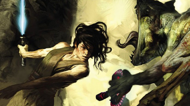
The image at the top of this article is from the American cover of Force Heretic: Refugee—one of the last NJO books—by Jon Foster. I chose it very deliberately, as I remember people complaining at the time that Jaina wasn’t pretty enough; ditto for Foster’s Mara one book earlier (below). But to this day, that remains my favorite image of her. The Jaina Solo in my head has spent her entire adult life at war; “makeup” isn’t in her vocabulary. She’s tired, messy, and sick of your shit.
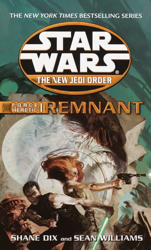 But beyond this idea of “attractiveness”, what I loved about Foster’s covers was that they weren’t trying to be a magical window into the GFFA, nor were they static collages like we used to get in the nineties. They were art—paintings, no less, and meant to be appreciated as such. And that’s what I want from my novel covers. Look at that Remnant cover again; Luke isn’t looking too hot, either, and a disembodied, video-projected Yuuzhan Vong head is about to bite Mara’s arms off, but that image evokes the feel of the Vong war to me (and the Original Trilogy, for that matter) more than anything of Nagano’s.
And not for nothing, but it was a painting of Aayla Secura Foster did for the old Star Wars ongoing comic series that captured George Lucas’ attention and led to her appearances in Episodes II and III. George is notorious for being more of a “pictures” person than a “words” person, but that’s a claim I don’t think any other SW artist in history can make.
Another recurring artist I love that seems to take a lot of flak is Tommy Lee Edwards. Like most (if not all) of the others I’ve mentioned, Edwards actually uses photo reference quite a bit, but with decidedly abstracted, painterly results; something I enjoy quite a bit. Which brings me to trap number two: “abstract” is not synonymous with “bad”. Take Hepburn, whose work on the Vector arc of Knights of the Old Republic (linked up top) is notorious in some circles for its wonky, cartoonish character designs. That kind of style is even more subjective than usual, and even I admit it didn’t particularly thrill me, but I respect Dark Horse for attempting something in that direction. Hepburn is actually capable of some pretty great stuff, and without companies taking a chance on stylized art once in a while, we’d have no Chris Bachalo or Jim Mahfood, no Miller or Mignola or Ramos or Oeming.
Lastly…let’s talk about Photoshop. Specifically, the Fate of the Jedi cover art of Ian Keltie.
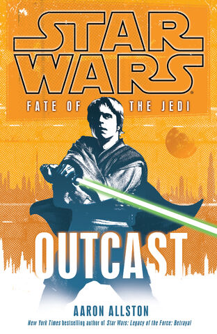 My educational background is actually in Visual Effects, so I’m qualified to admit that Photoshop can be a mixed blessing—it makes a lot of things that used to be hard very easy, and in so doing, it can allow a middling artist to skip over a lot of the work they wouldn’t bother with otherwise, or it can allow a great artist to take their craft that much further. It also has its own unique version of the aforementioned reference problem—notably, Saba Sebatyne was going to be on the back cover of Vortex, but was cut for want of a Barabel photograph.
My own feelings on how the full set of FotJ covers ultimately turned out are mixed, but as experiments go, I don’t see them as a failure. In an industry full of people trying to be Frazetta or Struzan, I think it’s enormously valuable that Keltie got an opportunity like that, and I think people are much too quick to dismiss Photoshop as “lazy” just because it’s not necessarily time-consuming. An artist like Keltie may not need the same skill set as a Trevas or a Nagano, but what they do need is a design sense; the skill isn’t just in the workload, it’s in knowing what looks good compositionally. If FotJ didn’t churn your butter, hey, I won’t argue with you, but might I recommend John Van Fleet? Or Jonathan Hickman?
The last name I want to leave you with is Scott Biel. Biel doesn’t have a page on Wookieepedia, but his work is all over it—he’s the Random House Art Director in charge of Star Wars covers. I’d never heard of him myself until doing research for this article (which led me to this great interview with him over at EUCantina), but without doing a lick of painting himself, he’s had his hands in every cover design for at least the last couple years. Remember when the cover for X-Wing: Mercy Kill was revised a little while after the first reveal? That was him. Typically, the publishers start by hiring a freelance artist to do a painting or rendering or what have you, which then goes to Biel for all the decisions on layout, fonts, color scheme, and so on. But there are two covers I found that he was the sole credit for, and I want to end with one of them.
Simple? Check. Unrealistic? Check. Bad cover? You tell me.
I really enjoyed this article on an element of Star Wars I have not given much thought to. I have to agree that the Force Heretic covers are fantastic. I certainly agree with your point about Jaina’s appearance although I remember at the time being uncertain who was being depicted. That is probably a good thing, ie., not a over-sexualized portrayal of a woman.
Very Interesting article. I was reading the Knights of the Old Republic comics and noticed a dramatic change in art when I began the Vector story arc (Scott Hepburn) and decided to look up people’s opinions on his art.
I think the reason I don’t care for his art in this particular piece is it gives the comic a more childish feel, which is something I don’t want to feel when reading Star Wars.