Recently, Mike made his defense of “ugly” art. By and large, I agree with his point that unusual or highly stylized art should be valued rather than simply dismissed. But I do take issue with his defense of Photoshop. Not because Photoshop is inherently bad — I enjoy many of the Fate of the Jedi covers he cites, and there has been other good artwork produced using photo reference and photomanipulation — but because I don’t agree that “people are much too quick to dismiss Photoshop as ‘lazy’ just because it’s not necessarily time-consuming.” Generally, people are right to dismiss Photoshop as lazy.
In the realm of art, both interior illustration and cover art, Photoshop has become increasingly prominent. The use of photomanipulation to create art pieces is common — and almost uniformly lazy. Even when it isn’t flagrantly work-on-the-cheap, photomanipulation’s effect is harmful because of its insidious tendency to substitute for classic artistic talent. And from a purely subjective point of view, I must say that it just never seems to look quite as good as good old-fashioned art.
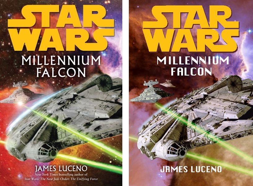
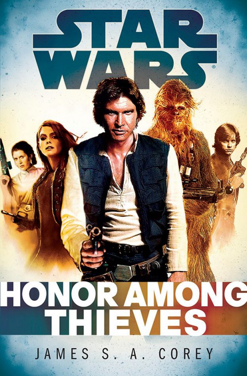
First, let’s take the laziness angle. It’s hard to argue that the cover for Millennium Falcon, for example, isn’t lazy when Jedi Council Forums moderator Billy Buehler was able to recreate it in half an hour using the same stock photos off the internet. Similarly, the cover for Empire and Rebellion: Honor Among Thieves does nothing to suggest impressive effort. A collection of stock photos of the cast run unevenly through a sepia filter, and in the case of Han’s arm and head, awkwardly tweaked, plus an original character who appears to be a lightly manipulated image of some airbrushed model, all on a generic school-picture backdrop, it practically screams low bidder. Which makes little sense, since Del Rey is willing to pay for multiple pieces from talented artists for interior art on Essential Guides, and employs great art on covers for the likes of Darth Plagueis, Death Star, Crosscurrent, and Riptide. Yet here we sit, with major novels represented to the public via cheap-looking photomanipulation jobs. Sure, photomanipulation doesn’t have to be this lazy — but it sure seems to end up that way more often than not. In competent, hard-working hands, Photoshop can be a great tool — but too often, Photoshop seems to take over, the insidious ease of photomanipulation lulling artists into the easy route, and enabling those artists reluctant to do the hard work of traditional illustration.
But even Photoshop jobs given more effort aren’t quite the same thing as hand-drawn or -painted art. In general, the Fate of the Jedi covers looked quite nice, but they ran up against serious limitations. Dependent on photo reference, they were incapable of actual artistic creation — artist Ian Keltie could put filters on preexisting images, but he couldn’t create a new image from whole cloth. Saba Sebatyne was bumped from a cover because there is no photo reference of Barabels. Kenth Hamner appeared on a back cover looking nothing like the previous images of him. An artist working with pen, pencil, or brush (or their digital equivalents) could have captured his likeness; one dependent on photos of models was left at a loss.
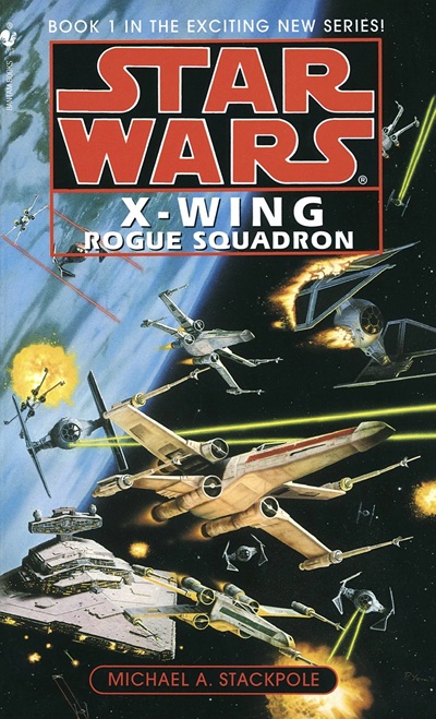
For another look at the inherent creative ceiling of photomanipulation, compare the inert, generic stock-photo collage of Millennium Falcon with the dynamic space-battle covers of the X-wing books. The X-wing covers are creative, exciting — because the only limitations to them were artist Paul Youll’s skill and imagination in depicting any scene from the books he desired. The Millennium Falcon artist, however, was stuck with whatever he could get out of film trilogy stills and space stock photos.
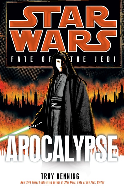
Further, manipulation of photos runs the risk of their losing their primary quality — realism. For the cover of Apocalypse, Keltie worked from a stock still of Ewan McGregor’s Obi-Wan Kenobi and Photoshopped on Luke’s head and a hood. The trouble is, the result doesn’t look natural. Luke’s head appears to be at an unnatural angle, and not quite proportionate to the body. In the process of adding the hooded head, Obi-Wan’s lowered hood had to be Photoshopped away, the process of which took the top off his left shoulder and left Luke’s entire body looking incredibly awkward should you look at it at all closely. The fact that these elements are supposed to be photorealistic only highlights their failure to come together naturally. The inherent stylization and unity of traditional artwork can make it look paradoxically more natural than the manipulation of real elements, where the unnatural is glaring.
To turn back to the cover of Honor Among Thieves, its two-tone cover of awkward Photoshop mashups looks horribly unnatural. Luke, on one side, is rendered entirely in sepia, while Leia, on the other side, retains most of her natural coloring under a light sepia filter, next to a sepia model who stands out from all the actual film characters with her airbrushed-smooth look. The shadows aren’t even consistent in direction, which especially highlights the artificiality of Han’s right arm, which has been replaced with one pointing toward the viewer (note that the shadows there are not black, like everywhere else on his body, but yellow). It’s a jumble of disparate elements which a sepia filter is attempting, but failing, to disguise.
Compare it to the classic Drew Struzan covers of the Bantam era. Like these artists, Struzan used photo reference. But rather than copy-pasting it, Struzan drew from it, creating traditional artwork. By using the full array of talents of a skilled artist, Struzan created works of art that were unified, natural, and appealing. Doing so was more work than copy-pasting film stills and applying filters — but can you really argue that it didn’t look better?
Classic artistic talents — the ability to create from the imagination, the mastery of proportion and form, the ability to create a unified and holistic work — are all too often sacrificed by dependence on photomanipulation. And the work suffers as a result. Simply put, Photoshop has more limitations attached to it than traditional art, and its seductive ease enables laziness and discourages the cultivation and flourishing of key artistic talents. I find it hard to say that Photoshop’s influence on the world of science-fiction and fantasy art hasn’t been an overall negative. Sorry, Mike, but people are right to be hard on Photoshop, and the trend toward it deserves far more scrutiny than it does enthusiasm.
I forgive you.
Just like you agree with the bulk of my piece, I agree with the bulk of this. I certainly wouldn’t defend Milennium Falcon, or argue that the Struzan era wasn’t better in many ways. Philosophically, I do like Del Rey’s willingness to go beyond film stills and find “actors” for EU character reference (like whoever that kid is they keep using for Ben), but there’s a lot of room for improvement just in terms of consistency. I’m torn about FotJ, because while I’d have loved to see Saba, Struzan had the same problem—for every Paradise Snare, there was a BFC with no Yevetha in sight. Lobot? Check. Nil Spaar? Nah.
Let’s just agree that we need Jon Foster back. Cool?
Agree with all of this.Well written.